There are four different climate forcing scenarios run for each of the models in the list. The Historical scenario is forced by the reconstructed evolution of radiative forcing since 1850, including natural changes (volcanic eruptions and changes in solar intensity), and human-caused changes (greenhouse gases and aerosols mostly). Another scenario, HistoricalNat, only includes the non-human climate forcings. There are also two scenarios for the future. The RCP2.6 scenario shows essentially the climate changes we have locked in so far, without further emissions of greenhouse gases. The value 2.6 is a maximum radiative forcing in Watts/m2. The RCP8.5 scenario is a high-emission scenario.
An "auxiliary plot", above and spanning the same time intervals as the temperature time series plot, can be used to compare the temperature records to climate radiative forcings (in units of Watts/m2) and various climate state indices such as the Nino 3.4 index for the state of el Nino in the equatorial Pacific. Also available to display on this plot are records of the changing lengths of 472 glaciers from around the world.
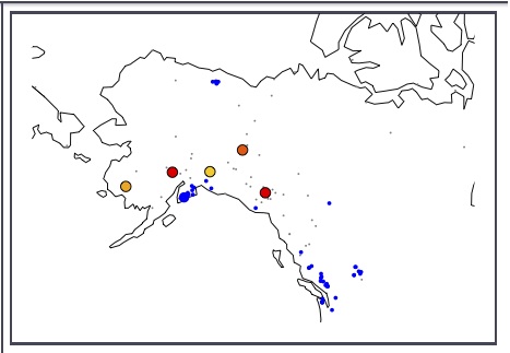
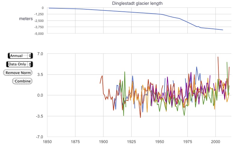
Left A study in tundra. Small grey dots are met. station locations fitting the vegetation classification Tundra. Blue dots are locations of glaciers; the large blue dot is the record shown in the upper time series plot is the Dinglestadt Glacier. The large dots of other colors are selected stations from those on the map in the "tundra" vegetation bin. Right Temperature plots from the selected stations.

Comparison of temperature trends between stations and the corresponding points in the CCSM model, Historical (with rising CO2, etc) and HistoricalNat forcings (without a human impact).
Selecting a country name, vegetation type, altitude range, or latitude range bin from the list on the left narrows down the stations in the station list. Multiple bins, selected simultaneously, are additive in the station list, so that a station will appear if it is in either of the bins. You can search for specific words using the text filter. Only stations that contain the text string in any of their attributes will appear in the station list.
Zoom into the map using the slider on the right, and drag it around by clicking and holding as you move the mouse sideways. When a station or a glacier zooms outside of the viewing area on the map, it will be excluded from the station list. You can roll the mouse over the station points to see their names and properties.
Averaging options include raw monthly values, or annual or decadal averages. An annual average is only calculated for years with a complete 12-month year of data. Decadal averages take all of the complete years and average them, even if there are fewer than ten.
Normalize the data by subtracting the average value from the time interval 1900-1950 from the records. Records for which there is no data from that time interval will disappear when this option is selected. When the data are normalized they can be combined using the Composite button which appears when there are more than one normalized records chosen. There is a seasonal cycle plot option which takes the average values over each month throughout the span of the avalable data. Temperature anomaly values (in the Calculate menu) are defined as the difference of a particular monthly value in the data from the average value for all years of that month. The anomaly plots are spikier than the monthly value plots because the seasonal cycle has been removed.
Temperature trends are calculated by linear regression, and the best-fit lines are shown in the time-series plot. Restrict the time span for the regression by resetting the numbers in the text boxes where the range is given. A positive trend indicates warming. After a station is selected, its location on the map is color-coded, with red for 0.2 degrees C per decade, and blue for -0.2 degrees C per decade.
The AR5 Models tab brings up the ability to view the output of many different climate models and forcing scenarios. The AR5 models were done as part of the IPCC Scientific Assessment process. The browser selects the grid point in the model field that covers the location of the data station. If you zoom in the map enough you can see an outline of the computational box of the grid point.
You can get a digital copy of the data you've selected by pushing the Data as Text button, which will tabulate the data you've chosen in another window. The data is in a comma separated variable (.csv) format which can be saved to disk or copied and pasted into a text file which can then imported into spreadsheets and other analysis or presentation software.
| Compare the climate records according to biome type, elevation, latitude, location, or proximity to water. |
| Compare a glacier length record with meteorological data from that region. |
| See how many stations you need to include in a global average before the results start converging. |
| If one picked a meteorological station at random, what are the odds that you'll get one that's cooling vs. warming? What about glacier lengths? |
| Find the smoking gun for human-induced climate change by compare climate responses from AR5 models, using either Historical (including anthropogenic forcing) and HistoricalNat (without human impacts). |
| Compare temperature data with various potential forcings such as solar variability and volcanic eruptions. |
 |
The University of Chicago 5801 South Ellis Ave Chicago IL 60637 773.702.1234 |